Monday 31 March 2014

Magazine Ad Artwork Sketches

These are the three potential sketches for the artwork that will accompany the magazine advert for our fictional band The Project. These examples may not be used at all and a different background may be used as other ideas may be considered between this post and the final artwork post.


     This sketch is of a bridge that was previously one of the potential images for the digi-pack artwork. I used the same font for both the artist title and the album title so that there's the idea of simplicity in the picture, as well as the symmetry intended with the use of the bridge and the trees at either side of it.
     I included the 'Pre-Order Now' sentence below the large font of Days Out In Sepia so that when consumers first see the large font, they see the imperative rhetoric below it; encouraging them to pre-order the product.
    The reviews were purposely positioned to be part of the symmetrical image I had intended. Because they are placed on the floor of the bridge, the single colour of the bridge would help make the reviews more prominent. But the main reason I included reviews was to generate fame and a positive feedback from big music companies, so that their reviews are reliable and therefore attract the consumer; possibly encouraging them to pre-order the product.


    I used the tree image again from the digi-pack because it's a simple image, yet it expresses an oddness about it due to the guitar being placed in the center of the tree's branches. The image was taken from the improvised scene at the end of filming Human where the drummer put his and the guitarist's instruments in the tree.
    The reviews again were placed at either side of the tree with the intention of presenting the image symmetrically. The idea of symmetry was applied because it juxtaposes with the eccentricity of the guitar and the album artwork, so it could garner a possible attraction from certain consumers. And again, a famous music company 'reviewed' the product, so it gains fame and attraction.
     The fonts for the artist title and the album title were changed and made different to each other because from looking at various indie albums, their artist and title fonts are different, like our digi-pack has. The reason for making the fonts different to them of the digi-pack was because I wanted to make the fonts look different in each ancillary product.


    This image is of the 'Lunar Park' fair, with the badly drawn Ferris wheel replacing the tree as the divider of the page; creating symmetry. The original image was used for the back cover of the digi-pack, which I intended to have because it connected visually to the album art. Also, like the other two sketches; the image represents going out, or a day out which is intended to connect with the album title Days Out In Sepia.
     With the fonts, I again changed the so that they would match because the idea of simplicity again became apparent, but I believe the final artwork will have the fonts different to each other again because of the traditional use of them on artwork. 
     The reviews this time are on the same side, now opposing the 'Pre-Order' box; setting out the design a little more clearly than before, despite the lack of symmetry between them. As always; one of the reviews is from a famous music magazine/company to generate recognition through the positive feedback. 
     Finally, the 'Pre-Order'box now includes the date for the release; my birthday. Like the first sketch; it refers to Human by declaring that it's a single able to be pre-ordered along with the album, so a connection is present. This is the most interesting of the sketches in my opinion because it represents a more fun side to the album, which is 'present' in the song Lunar Park; the image.


Tuesday 25 March 2014

ARTWORK

The image is rather bad quality, most probably due to the screen-shotting. But here's the artwork in all its 6-sided glory!


     For the front cover, I decided to stick with a simple image of two band members standing on either side of the tree from the music video we made. The overall tone is sepia, with the intention to make the whole artwork seem old or vintage. However, the deletion of the eyes of every band member on this digi-pack was intended to imply that music isn't a feast for the eyes, but for the ears, emanating from the mouth and the instruments. This is why I shot a photo of the guitar in the tree; to direct the consumer's attention to the instrument's odd positioning to emphasise this message; It's not visual material, it's audio material. It's supposed to generate a feeling of confusion because it looks so eccentric in a normal background.
      I named the band The Project because that's what the whole media coursework is; a project. It's a monosyllabic title, like The Killers, because the band doesn't need a creative name if the music is the creative factor of the coursework as well as the artwork and the rest of the ancillary products.
   I titled it Days Out In Sepia because of the superficial reason; the sepia tone, and also the reason that every image in the digi-pack is outside, and in particular the 'Public Footpath' sign, the Ferris Wheel and the Castle being synonymous with going on a day out. The three squares of artwork that aren't there to serve any purpose other than to present and promote the album have been accompanied with lyrics from certain songs: the castle background is presented with the lyrics from the 9th track Castle; the band member without any eyes leaning against the tree is accompanied with lyrics from track 1, Sound Without Sight; and the footpath sign is shown along with lyrics from track 3 Human
    I named the record label Out of School Records because I had used the same title for a previous short film that I made as an extra-curricular activity, named Out of School Productions. It is intended to be sort of a running trademark with the labelling. The barcode adds a sense of authenticity to the album as well.

   The track names were all thought up on the spot as I inserted text boxes onto the back artwork. I had, the vast majority of the time, since revisiting the image that was took 2 years ago, been heavily considering this photo for the track-list background because of the space that the sky gives beside the ferris wheel. Enough to place the 10 songs of the track list in. I named a few particular songs from certain images in front of me: the song title Sound Without Sight was named that because of every band member being eyeless, with the intention to emphasise sound, not sight. Human was named that because we made the music video to the original song by The Killers, so a connection was prioritised. Lunar Park was named because of the theme park background to the track list, which is also called Lunar Park, so it suggests that this song will be made into a video, because of the visual representation of it, the same with the lyrics to songs accompanying other artwork. I also named track 5 Braggadocio because it was simply the title of the font I was using for almost the entire artwork. And finally, Castle was named that because of the inner square of artwork consisting of a castle in the distance, protruding from a post-modern, yet slightly pastoral setting.
   The vignette style of the artwork for the disc-holder was intended to match the subsequent insertion of the blank disc-holder image, eventually making it more transparent so that the background image can be seen, as well as the circular match between the background and the disc-holder.


Monday 17 March 2014

10 Chosen Images for Album Art

Here are the images I have chosen for the artwork for the album digi-pack. They have been altered through iPhoto.


This was taken very recently. I blurred out the eyes with the intention of indirectly saying that it's not an album of pictures, but of voices, music and sound. The sepia effect, as is the same with most of the other pictures, is intended to express a sort of antique-y feel, as Gabrielle Aplin's single artwork for 'Home' has the same look; a countryside background.


This is also a new image taken recently. It's an image of me looking at the guitar in the tree (I don't know why. Viva la obscurity!!), with the intention to fill in the space left by Ryan's (the singer) departure from the project. The vignette effect is just to say that this is the image that will be the artwork for the disc-holder.


This image was chosen because, after I thought of the subtitle of 'The Project' being 'Days Out,' the photo of the coastal park was a very useful image because it was synonymous with the title. This will most likely be intended to be the back cover, where the track list will be placed over the sky to the right of the ferris wheel.


I chose this image because the words are fully conventional to the music industry. And the sepia effect gives an indie feel to it, as well as an antique look.


Again, 'Days Out' and this image connect well. Also, as I said in the previous post, the rusting of the sign  could imply idiosyncrasy, as people aren't following the directions; instead going their own ways and doing what they want. Going your own way, or 'choosing your own path' is frequently considered as a factor of life. 


This is a person finding their own way in the world after a long time of following others. They don't know what to expect, but they'll never find out until they go through the 'door' and see. This image could be symbolic of a few meanings, which is why I'm possibly choosing it as the artwork for a square.


As I said previously, this is a still of the roundabout that Nicole jumps off of in the 'Human' video. However, it is the 'Days Out' connection along with this that drives me to use this image for a square of artwork.


Connected to a song I'm thinking of calling 'Fog Lamp,' this image would fit well with it. But it's also the artistic style of it that creates an atmospheric image that makes me consider this for part of the artwork.


As mentioned previously, the castle overlooking the modern housing was a very useful image because of how out of place it seemed. But, like other images, it connects to the 'Days Out' title and the antique-y look fits well with how old the castle is. This image is also considered to be the back cover art because the track list would look well and fitting in the sky. 


This is an image I'm considering for the front cover because of how perfectly well Josh is framed, as well as the intended focus on the eccentricity of the photo: no eyes, for the same reason as mentioned in the top image. Also, the flagging and facial expressions looked rebellious, and the field background  looked nice and rustic. Apart from the goalpost...


Jack is very most likely going to be used for the artwork because he's part of the band, and also because the tree appears in every shot of the band members. I blurred out his eyes again, like I did with the other photos of the members, and the countryside look was very useful as well as the 'Days Out' connection. 

These images will be narrowed down to six for the digi-pack artwork, so I will present the 6 chosen images on a design template for the album art. 


Saturday 15 March 2014

The Killers 'Human' Music Video Analysis

This blog post was intended to be published before we begun filming our own take on the video.


 The first 6 seconds of the video consists of an obscure camera angle, which may be intentional despite it looking unintentional, because all we hear is the band getting ready to perform (we can't see them) on a sandy yellow setting (possibly a desert). This is proven when we hear one of the band members (most likely Brandon Flowers) saying "yeah, hang on," as though they're not ready yet. The whole meaning of this short section could be just to show a behind-the-scenes clip to set up the video, because the next shot is clearly signifying that the video has truly started. The mentioned shot is a possible mid-shot of the 'k' from the band's title suddenly lighting up in synchronisation with the first instance of music; the tune of a guitar. After, an establishing shot of a desert sets the scene for the video, with the golden and yellow palette implying a mostly positive and bright tone. In the same shot, Brandon Flowers (lead singer) is seen walking by and stopping, framed between two large boulders, which emits a slightly eccentric feel, such as the superficial question; why is he in the desert? Could it signify that because it's a vast landscape, there's the chance to be alone and expressive without any judgement from anybody else? And because the song could be implying a sort of 'transition' from being a normal, average human being to being a dancer; a spontaneous person, who could be idiosyncratic in nature, and with the band being in the desert, a very unusual setting, could emphasise that 'dancer.'
     Following this is a series of mid-shots of Flowers singing, with a stage light behind him to emphasise his presence, that we should be focusing on him. There's a dissolving transition in between these mid-shots that shows four self-portraits of the band on stands, from a long shot. I can't exactly interpret the meaning of this, even with the lyrics corresponding to this scene; "sometimes I get nervous, when I see an open door."It could be to do with the positioning of the portraits (two closer to the camera, and two further from the camera), but of that, I'm dubious. Next is a return to Brandon, this time shown from a more close-up shot and the camerawork is more loose, eventually panning up to catch a bird flying past, shot with a more steady angle and there's the familiar distinction of look between Flowers and the bird, as he is wearing a suit with golden feathers circling the collar. The bird is a black colour, yet there's a golden tail. Could it be that he wants to fly away like the bird does, which is implied with the line "cut the cord" as the bird is shown, which most likely means to cut yourself off from the world and be a 'dancer.' From this scene (0:43 seconds in) up to the 1:10 mark, there are multiple transitions between each band member performing, shown from mid and long shots as well as a slight close-up shot, with every shot circling the performer. Each guitar stroke corresponds with the transitions, creating a rhythmic and synchronised relationship between sound and vision. At the end of this scene, Brandon punches the air (from a possible long shot) as a sudden loud beat is heard, giving way for the instrumental.
     During the instrumentals, we're shown, from birds-eye shots, mid-shots and long shots, a Tiger and a Lion roaming the desert, with intercutting shots of the band, as though to  imply that we are the animals in the desert.
    As the singing returns, we are presented with a multiple Vignette style framing of different shots of the band playing, with the style of the appearance of these frames paralleling the rhythmic beat. Eventually, four of the frames are replaced by mosaic self-portraits of the band members (the YouTube thumbnail image above), obviously referring to the mosaic pattern of the 'Day & Age' album art, which is also an image of a desert (or an oasis), as well as the self-portraits being the single art for 'Human,' 'Spaceman,' 'The World we Live In' and 'A Dustland Fairytale.' The camera hovers around the set, putting instruments such as the cymbals into centre frame as well as Brandon also being framed in subsequent shots, with another appearance of the bird, circling the band. It's clear that this video focuses on the band performance more than anything, which is a rather frequently applied convention of indie/alternative music videos, like with Kyla la Grange's 'Walk Through Walls,' and Mika's 'Grace Kelly,' despite the vast majority of indie videos focusing on symbolic or plot-based scenes, hardly ever showing the artist's performance. Also, with the whole tone of the video awash in golds, browns and yellows, we know that it's a video expressing a positive coda. We see again the Lion walking for a few seconds, which seems to raise a question: is it walking towards the band?
    A wide shot (from a fair distance) of the band obscuring their faces with their mosaic self-portraits still reveals their identities, yet seems to distort them because the division between the darkness of their clothing and the more colourful portraits could be interpreted that they're more mindfully artistic. However, the line "are we human" at this point could be reflected by this scene, because it could even be interpreted that the band are hiding their faces with portraits so that we can't see their true faces, which may not be 'human,' so to speak.
   Then a high angle shot establishes the set on which they're performing, which is then followed by the band with the portraits again, however this time they're swapping with each other; taking on a new identity. Could this imply a swap (or transition) from being 'human' to being a 'dancer' because they're not themselves anymore, but somebody else. For around 7 seconds after this scene, the camera loosely (again) hovers around the set, capturing each band member performing, shown with some closing in shots, which possibly begins to imply that there's a bigger reason for why the video looms upon the performance and hardly any other scenes shot outside that area. It links to the Lion walking towards an undisclosed location. Is it the band? Can the animal hear the music?
  After this, the music builds up to a more faster pace, shown with 15 seconds of high angle shots of Flowers and the band, which could imply that because the music and the speed is building up, the high angle affectively emphasises that. The build-up is held with a sudden drop to the original, slower pace, with a long shot of the band which applies the contra-zoom effect (see Vertigo and Jaws) to make it seem that they're even further away, and they're without the stage setting. It seems expressionistic because of the setting: a desert; a vast open landscape where, if you were alone in it, the contra-zoom emphasises the distance of it (this reason may be insubstantial).
    The camera then returns to Flowers singing in a kneeled pose, holding the wire of the microphone with a tightness, making it taut, as though he's under tension and stressed (which I don't exactly know how to interpret it). Then, as we hear "looking for the answer," the same shot of the two boulders framing Flowers is revisited, this time with him walking, then stopping to look ahead, and then continuing to walk, which implies the "looking for the answer" despite us not entirely knowing what that is.
   The music builds again for around 8 seconds, then suddenly being met with a drop in beat which gives way to another chorus. The chorus consists of slow dissolving transitions between the band (shown from high and low angles, as well as continuous shots) and very high angles of a desert mountain/hill to emphasise the enormity of the setting.
   The chorus repeats and fades towards the end of the video, repeating the line "are we human, or are we dancer," along with a single shot of the Tiger that was introduced before the Lion was (I don't know why the Lion was shown more frequently, however), positioned in the same background with the self-portraits mounted on stands, which presents the Tiger in a close-up, taking up most of the frame from the left, with enough space on the right to define the familiar background. It could be viewed as an exodus of human qualities and being exchanged for qualities that metaphorically represent freedom (of the mind); the Tiger, because it's a wild animal, it's free, and spontaneous (we don't know how it'll act), like a dancer. The desert also reflects that possible interpretation of freedom, as well as the portraits turning off (lights), which could also be signifying the end of the video.
     The video ends with a low angle of the band standing and looking at a mosaic sun in an evening sky (the colour is too orange to be the moon), which is an odd, yet artistic image which mirrors the 'Day & Age' album art. The whole setting then transforms into a mosaic pattern, which proves that it mirrors the album art, as this final image is the end of the video.
    'Human' was 'Day & Age's most successful track, so this still shot of the mosaic desert landscape could be promoting the album by referring to the successful song through the album cover.
   

Thursday 13 March 2014

Chosen Images

Here are the images I've considered for alteration for my album artwork. Most of these images were taken randomly but with the intention of looking at least stylistic, artistic or conventional to the indie/alternative genre. But still, some are just plain random. Because of there being a large amount of images, the next post will be the images in an edited/altered form, however I will have to get rid of quite a few of them.


These first two images were taken to represent the transition from 'human' to 'dancer' as explored in the music video. The image of a person emerging from the shed is a more stylistic take on the re-birth of the 'dancer' that happens as characters who have changed appear from bushes in the music video.


This photo was taken randomly, yet looking at it again, you could interpret it as a caution. The caution could be that if you drink too much alcohol, then the long alley shown in the picture could represent how long it could be before you come to your senses and feel normal (sober) again. Interpret it any way you like. As though we're producing artwork for a digi-pack album, the image could just be a reference to another 'song' on the album.


The roundabout is the same one that the female character (played by Nicole Denman) spins on and jumps off of in the 'Human' music video. It's basically a still-shot of that location.


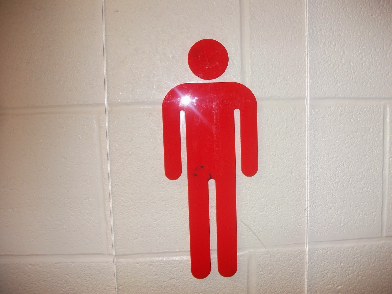
A simple photo that is ambiguous. There's the actual meaning (a road sign), but then because it's considered for the album artwork, the sign could be interpreted as though you're 'giving way' for the band, or maybe 'giving way' for yourself to change from 'human' to 'dancer' like in the music video.


This image is purposely focused on close-ups but not on long or establishing shots. This is to represent the unknown 'out'look of something until you actually pass through the obstructions that you can see (the wood in-focus) which block you from finding out. 


This image represents nature. The shed is wooden, the leaves are, well, leaves, and there's a human in centre frame.


I couldn't really interpret anything important in this image except from showing that inanimate objects enjoy music, and in particular, the song 'Human.' Anybody and anything would like it. However, because the original artist is The Killers, and the image is of a skull, we could link it to the band. No idea how.


The defacing of Velvet toilet roll with a red bingo marker is intended. 'Wiping' away 'your average human self' is simply linked to toilet roll... because it wipes, and with ease, which could be another interpretation: people can change very easily. For good or for bad. But there's no reason for it being inked in red, that's just the only colour I could work with.


How on Earth did that end up there? That's why I took a photo. Because it's odd, and seems to fit in with the 'alternative' genre of the band. The colours could also be interpreted as the 'dancer,' who isn't just monotonous, but spontaneous and unexpected.


Both the man and woman are humans. As is the song and video title of our production. They are anonymous; without any defining features. They could be used in the album to imply an equality, as well as possibly mirroring a 'song' title. 


A psychotic Leon-oid. Basically, this image was taken to refer to the change in the characters in 'Human,' which is why Leon, who plays the male character, has propped his hand up in a gesture that implies the 'frowny-face to smiley-face' routine. The hand has just been at the bottom of his face, which was frowning, and now it's passed his frown to the top of his head, now revealing a worrying wide-eyed grin of a smile.


This is the shadow of the tree featured in the 'Human' music video. Its shadow is almost symmetrical, and it could be viewed as an odd image because there's the juxtaposition of cold and warm in the picture. The tree is still bare, so it's still in the winter/spring boundaries, but the surroundings are that of a sunny day. Its oddness could fit with the eccentric nature of the music video.


I like to call this 'Camception.' Me taking a photo of Jack, taking a photo of Josh, taking a photo of the thorn bushes in front of him. This was intended to give a slightly artistic tone, as it shows a watcher watching another watcher, as though to imply that whatever you do, another person could be doing the same, either towards you or not. Or it could imply plagiarism, as somebody is copying somebody else's activity or work.

This image seems to look like a re-imagining of 'Kes,' which is an important part of British media culture. Josh is seen flagging with two digits, as though to appear victorious, like Billy. Other indie albums refer to other forms of cult media, such as Bastille's 'All This Bad Blood' containing a song titled 'Laura Palmer,' which is, along with some evidence in the lyrics, referring to the cult show 'Twin Peaks.'


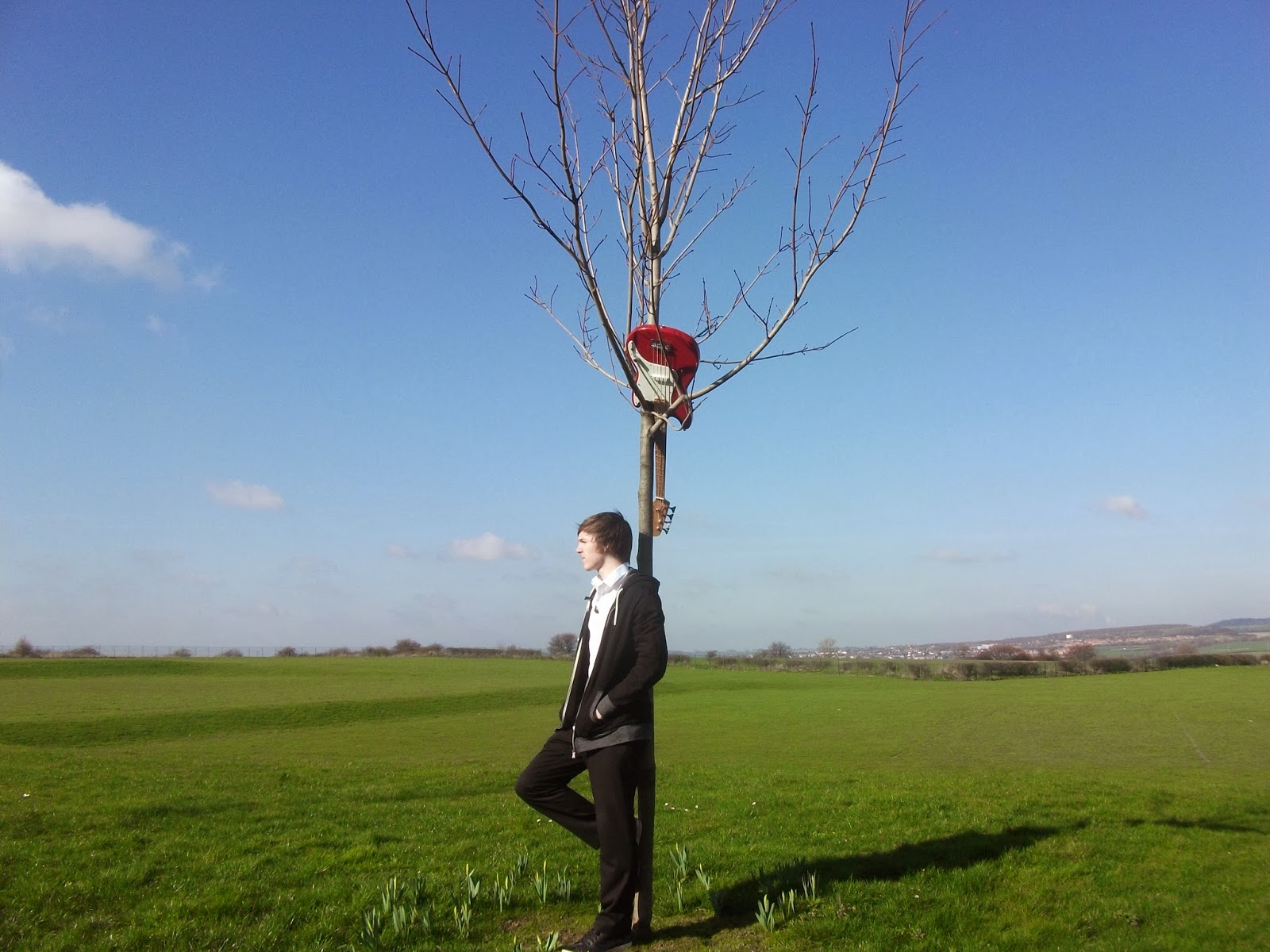
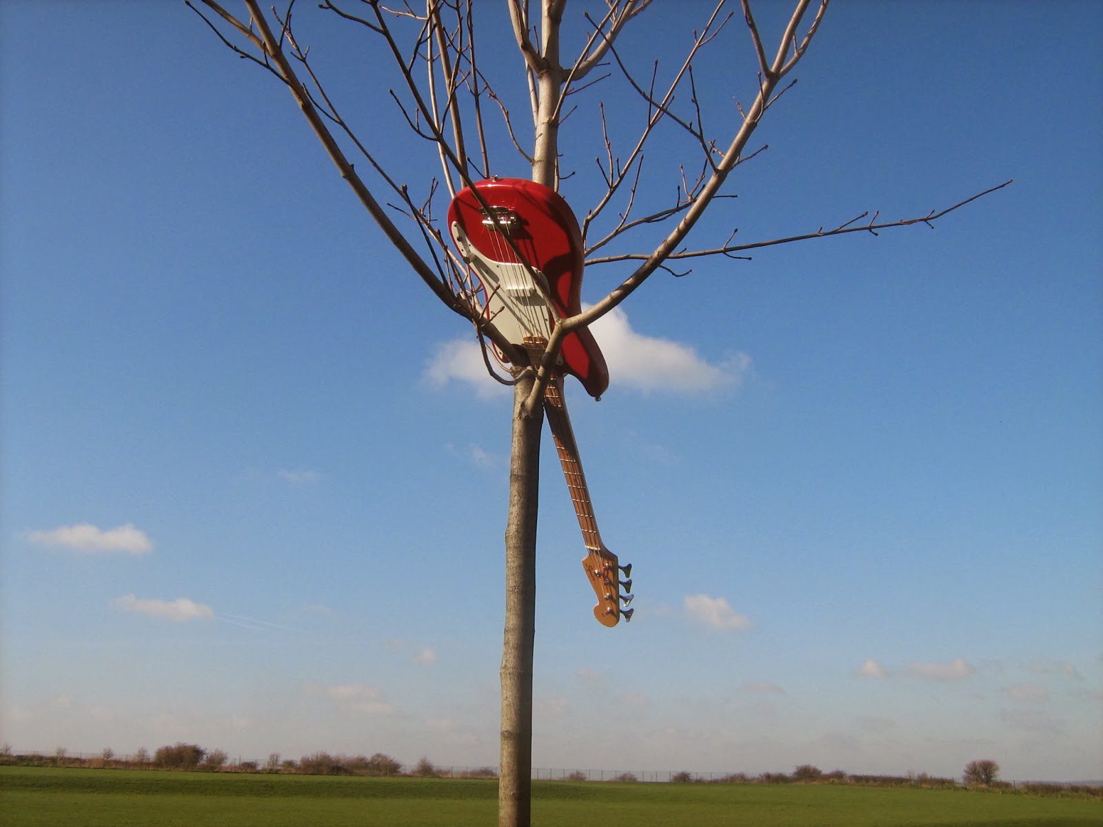
This was considered quite quickly, because after adding the improvised positioning of the guitar at the end of the music video, we thought that because it was very stylish, we decided to photograph it. It has a very simple, yet effective look as it's centre frame and an odd placement of an object otherwise disassociated with a tree.


These images are of one of the band members, Jack, who played the keyboard, which unfortunately doesn't fit with the guitar in the tree, but it was due to other members not being present for the photos. Again, the image is simple, yet effective because of everything in the picture being present in the video. The image below was another idea of changing Jack's look from dark to bright.


These words are relatable to many forms of media (specifically the music world), so with the words 'Sold Out' covering the image, it would be very useful for the album because it presents it, and the performance, as professional. It's a very frequently used phrase in the music industry.


This was a photo taken at least a year ago (as were the following six images), but its natural beauty could be artistic, as it looks like an image that would be painted. It is very simple yet effective with colour (greens, whites and browns), which is a big factor of many indie album covers such as 'My Head is an Animal' from Of Monsters and Men, where its tone of colour isn't the main focus, instead it being the whole image as the focus point.


This image of a coastal theme park would be very useful as a backing cover. This is because the large space occupied by the skyline to the right of the photo would be a good place to put the track list. It still allows the consumer to look at the traditional British park/fair.


This was genuinely a random photo, yet if I edited it in a certain way, it could fit with the (establishing) tone of the album artwork. I compared this image with the album cover of 'Union' by Saint Saviour, which was simply a bonfire shrouded in darkness, which looked beautiful and somehow connected to the album because it's powerful. As is fire, which could signify 'burning' passion or desire, heated situations etc.


The bridge I photographed here has an almost perfectly symmetrical look. It's a faded colour of brown (or maroon maybe) and yellow, as though it's been neglected, which, if exaggerated, could refer to the neglecting of the character's average human features in 'Human.' It could also refer to a unit of time it takes to get back to how you once were, like the previous image of the bottle in the alleyway. Its inclusion in the album would be rather artistic because of its symmetrical look, yet its background being a bare wooded area could seem odd.


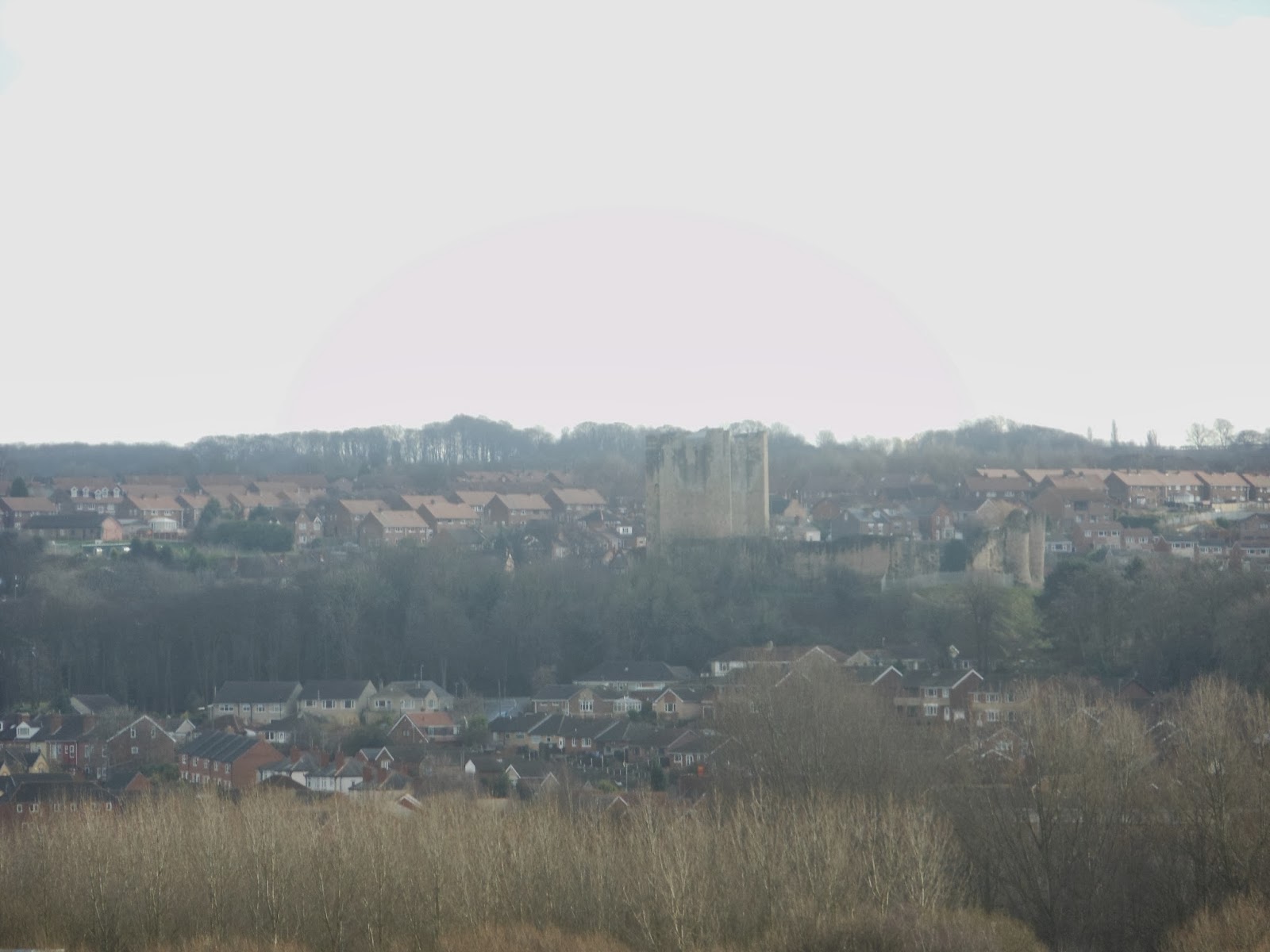
This image has been heavily considered for artwork because of the castle. It's an establishing (or possibly long) shot of a town, with a castle stood overlooking the houses in centre frame. The image is odd because of the castle's location in the modern day, and it's very useful because, like 'My Head is an Animal' by Of Monsters and Men, the first thing the consumer would notice is the castle protruding from the landscape, surrounded by houses, as would the consumer first notice the wooden house/cabin in the sea on the Of Monsters and Men album.  


A random photo, which heavily implies that the 'Public Footpath' hasn't been used for a long time. I could interpret it as it being idiosyncratic; a person not taking the route outlined for them, but instead going in whatever direction they please, or for a simpler phrase, going your own way. One that is exclusive to you. This could refer to 'Human,' as the characters become what they want to be: different and spontaneous.


This image could have the same meaning, or interpretation, as the image of the bridge. However, this picture of the top of a viaduct is much longer and more stretched out. It's as though you have to walk through a lot of nothing  to get to what/where you want.


Like Arcade Fire's 'The Suburbs,' this image (taken very recently) shows a car, in which I photographed the top of. It doesn't have any significant meaning, but the tone of the colours are familiar to the tones that are conventional for an indie/alternative album.


This is a very simple picture I took, which could be easily referred to other images in different indie albums. Bands like 'Wolf Gang' filmed their 'Dancing with the Devil' video, which was filmed in a low-lit pub/restaurant, making it seem very reflective with the lights mounted on the brown (or dark red) walls of the setting. It gave the video a very rustic, indie feel. It's the same with the colour of the leather couch below, which is also a dark red tone. 


This is me (the assistant director, editor, storyboard-er, location scouter, and other contributions, of 'Human') staring at the 'tree-tar' that was improvised at the end of the video. It could be seen as a possible behind-the-scenes still, because I'm looking at one of the centre-framed images in the video. Even though it isn't directly linked to another similar indie album, the idea of it being a pseudo-behind-the-scenes image is relatable to Paloma Faith's 'Do You Want the Truth or Something Beautiful' album, where one of its artwork images is of Paloma in the same setting as the front cover, but with make-up artists and set-designers in the frame setting it up.


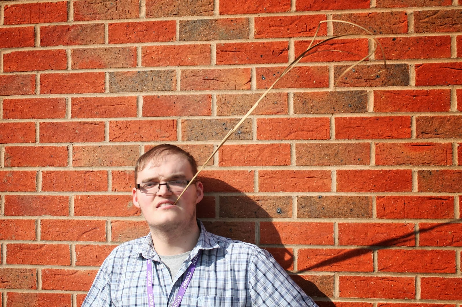
These last two images are, of course, me again. Now to be honest, I had no clue what I was thinking when I found a blade of tall grass and decided to pose with it between my teeth, but for one reason or another, it seemed to fit, because it was odd, eccentric. The shadow of the tall grass in the last picture perfectly underlines the 'Out of Hours Access' on the sign, with a possible interpretation of this sign on a music album could be simply its instruction: to point toward. It could be pointing towards the band or the music. But it could instead be used as stylish, or artistic, abstract artwork. 


Tuesday 11 March 2014

All Photos for Artwork

Here is every photo taken for the potential album artwork of our cover song/music video 'Human.' The next blog will be narrowed down to particular images that I would find useful.