This is the second question of the media analysis/evaluation, presented on slideshare:

Showing posts with label analysis. Show all posts
Showing posts with label analysis. Show all posts
Wednesday, 7 May 2014

Thursday, 10 April 2014
Evaluative Analysis
1. In what ways does your media product use, develop or challenge the forms and conventions of real media products?
Main Product- Music Video

Ancillary Text 1- Digipak

Ancillary Text 2- Magazine Advert




For my A2 media coursework product, we produced a music video rendition of 'Human' by The Killers. The video uses, but also challenges the conventions of real media products of the same genre; indie/alternative music video.
I, and the rest of the group, produced the storyboards with the knowledge of a convention of music videos; three separate narratives, which mainly consist of two different stories that eventually connect, and then another narrative with the artist or the band performing. I storyboarded three narratives that correspond with that certain ideology of conventional music videos, incorporating two separate stories, one involving a man, and one a woman, who are both presented as visibly depressed due to their average human qualities. The video proceeds with these characters eventually becoming more optimistic and spontaneous; becoming the dancer. I annotated the lyrics beforehand and noticed certain lyrics that influenced my interpretation of the song meaning, in particular the line 'are we human... or are we dancer?' And 'pay my respects to grace and virtue' also, because it questions how we take advantage of our individual qualities, then paying respect to them as we become less worrying and much more optimistic and spontaneous. The two characters I have used in these two narratives both represent two different unusual factors: The woman becoming less concerned about the average and disadvantageous features of being human, instead opening herself up to the world and doing whatever she pleases because it's her prerogative; and the man representing curiosity as he follows the music of the band (third narrative), not concerned with anything else, just following his curiosity, doing what he wants. This is what connects these two characters; they aren't conforming to the conventions of being human, which is my main intention from how I interpreted the lyrics. Finally, these two characters journey towards the source of the band performing, which is the third narrative, where everything and everyone in the video come together. From this certain convention, I've learned how to follow and apply the idea of multiple narratives, able to film these narratives separately and then piece them together via iMovie, constructing the music video out of a story driven by metaphors and some literal visualisations. The problems that I could improve on are the visual interpretations of the lyrics; making the connection between the two characters more clearer for the spectator, possibly filming a scene where they both perform the exact same action.
I followed Andrew Goodwin's theory on music video types: illustration, amplification and disjuncture. One or two of these categories are used in many conventional music videos, like The Asteroids Galaxy Tour's 'Heart Attack' (disjuncture) or Adele's 'Chasing Pavements' (illustration & amplification).If I could improve on the video in accordance to Goodwin's theory, I would focus on only one category instead of multiple ones, because I feel that doing this may have driven the video to be quite obscure in places.
2. How effective is the combination of your main product and ancillary texts?
Main Product- Music Video
Ancillary Text 1- Digipak
Ancillary Text 2- Magazine Advert
I feel that the combination of our main product and my 2 ancillary products are much more effective than the actual video, and also very effective as a whole. The metaphors, locations and the cast used in the video all connect to one or two of the ancillary products, such as the main feature involving the reoccurring tree background that the band perform around which is present on three separate images on the digipak artwork (ancillary text 1). The location of the band performing is also the same location in which I took the photo of Josh Hobson (one of the band mates), yet the positioning is to the far right of the tree from the video, and my intention between these three products, location-wise, was to follow certain criteria: shoot outside and have a wide open space for the background. This I believe is quite effective because of the indirect connection (regarding location) between the three products, and made further effective because not every image was planned, but improvised (see ancillary text 2). I also thought the spontaneity from the improvisation was effective because it paralleled the intended visualisation of the lyrics (being of average human qualities, and then transitioning into a more spontaneous character, like a dancer), which then influenced the shots of the instruments in the tree on the digipak artwork, as well as ancillary text 2's improvised flagging gesture as influenced by one of the band members walking up to the camera and forming a gesture reminiscent of the film Kes (which is what then influenced me to name one of the pseudo-songs in the digipak tracklist). Another connection between the video and any of the ancillary texts, besides location, are lyrics and metaphors. The lyrics 'pay my respects to grace and virtue' were included along with the image of a rusted footpath sign that metaphorically implies the line 'are we human, or are we dancer' (although not originally intended) because of the deeper implication that people are making their own path, as shown with the rust. I believe that the deeper meaning of that image also contributes to the overall effectiveness of the combination because of the chorus lyrics in the video and then one single image representing that narrative along with another line of lyrics.
Altogether, I believe the indie/alternative genre of the video fits perfectly well with the sepia tone of the ancillary texts, due to the fact that the colours are simple, as is the palette for the music video because it's the indie/alternative genre, where the features are much more 'structured' and not all over the place. The intended odd nature of the video, with the spontaneous actions of the characters to reinforce the difference between human qualities and that of a dancer's, combines very effectively with the images in the ancillary texts. I intended to wipe out the eyes of every person in each image because I wanted to present the superficial fact that music isn't media for the eyes, but for the ears.
The music video promotes the ancillary texts, and vice versa. Our music video promotes my album Days Out In Sepia by The Project (fictional cover band name), and then the magazine advertisement promotes the album and the video, with features I added that made the advert seem much more authentic, such as reviews from music magazines, social networking links, a website address dedicated to the album, a QR code and also a screenshot of the album with details on its release, as I knew that every music promotion details the release date. The inclusion of an actual QR code that links to the music video on my YouTube channel is a completely new and very useful feature I have used, making the ancillary text seem as close to genuine as possible, which I am very pleased with.
These three items combine very effectively through their contributions to one another, their connections in terms of what's in the video and what's on the ancillary texts, their simple yet attractive colour schemes, and the idea that they're ordered correctly in terms of the promotion; the video/single being released first as a taster, then the announcement of the album details, and then the further promotion of the album through a different media text. They all combine to create one big promotion of the same product, which is again very effective because it's multi-purposed. There aren't any improvements I would make to these ancillary products, because they correctly represent the factors discussed in the indie/alternative genre.
3. What have you learned from your audience feedback?
From the feedback I was given from various audiences, the overall 'score' of the music video was fairly average, the overall score for the album art was fairly positive, and the magazine advert was very positive.
For the music video, the most prominent and frequently discussed problem was the synchronization of the miming and the background music, 'especially at the end.'
This is the main problem regarding the video that I would consider for improvement, as well as learning from this particular feedback that synchronization is one of the largest factors of how smoothly and well-edited music videos have to be.
I have learnt from the 'does it match the intended genre' question that audience views are dynamic and their views on the indie genre differ.
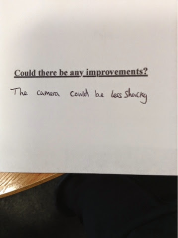
Based on the above image, and because it's likely to be similar to other answers if more people were asked, I would improve on the representation of the symbolism, as I myself seemed to be confused on how I represented such allegory, like the transition between mood is only shown by the attitudes of the characters, yet the intention of the symbolism isn't reinforced by any literal representations, like I could've used sticky labels that the characters mysteriously have (I did shoot these scenes, but time was running short to edit them in), with the words 'human' and 'dancer' between two separate labels.
Finally, I have learnt from the improvements section of the questionnaire that audience's expectations differ as mentioned before, but these improvements are ones that could be applied quite easily.
For the ancillary texts, because they're both the same in tone, font and image-wise, I will be viewing the reviews for both products.
There has been a review regarding the presentation of the products, with the font and editing ("Better font and better editing needed") requested to be improved on, because the products, particularly the digipak album font, need to be clearer and more readable, which I understand fully because of the Braggadocio style font being block-styled letters may be unreadable to certain audiences. So to improve, I would change the font to another which has more spaced out letters and a different colour to make them prominent on the sepia backgrounds.
What I've learned from the audience feedback for the ancillary products is that they're more praised than the video, but it depends on who views them and how they review them. I've learnt that the ancillary products do adhere to the indie genre as well as the video.
4. How did you use new media technologies in the construction and research, planning and evaluation stages?
In the construction/research stage of the production, I used media technologies, but only certain technology that was new to me. Because it's the research stage, I researched 5 music videos of the indie genre and analysed them, with the media technology used being YouTube to view the videos and the blog to analyse them. I printed out the lyrics to Human and annotated them to generate an interpretation on what the semantics of them are.
Slideshare was a new media platform that I used, researching Andrew Goodwin's theory on music video categorisation, to gain knowledge on spotting differences between other videos and also applying categories to our music video.


I also produced a music video presentation on Slideshare where I mentioned certain features of The Killers' music video, but upon viewing it the second time, I feel that the PowerPoint is much too short and not exactly interesting information-wise. If I could improve on it, I would follow the areas I mentioned that I said I would cover, therefore making the presentation longer and much more interesting.
Another new technology, or platform, I used was a collage generator called Photovisi, where I drew knowledge from various indie music videos and presented the typical features of them, with focus on location, costume, regionality, subliminal messages ans surreal imagery. However, because the presentation is more image-focused than information-focused, I only noted these typical features and presented them as captions to the photos, yet I know that what I was intending was still clear, and the only improvement I could've made was to add a little more information to provide as clarification of what my intention for the collage was, despite the title 'What are the typical features of an indie music video?'
For the planning stage, one of the new media technologies I were introduced to, for media studies in general, was YouTube, as we had not previously used the website before A2 to actually showcase our work, only linking our blogs with research information to YouTube and other sites. The main planning that was shared on my YouTube account was the storyboard drawing, which I presented and edited in accordance to the procession of lyrics, of which I used iMovie, an application used before for AS' 'Curiosity,' to create.
Another new media technology used was green screen, which we planned to apply for certain forest scenes, but the filming of forestry and the subsequent pasting of the image into the video proved useless due to the incorrect mix of colour. If I could improve on this, I would instead film a different background with better lighting so that there would be a lesser chance of a mistake.
I (and the rest of the group) was introduced, during planning and before filming, to HD Camcorders with SD Cards, replacing the DV tapes used in AS. I believe this new technology put us more to an advantage time-wise, but considering there were problems concerning the mix-up of memory cards and taking longer than anticipated to find them, a problem which I ended up solving by simply dotting our memory card with a marker. I was also introduced to a Gear-Pro camera which provided us with the liberty of incorporating sweeping and unbroken shots at whatever angles, with a particular example present in the finished video where the camera smoothly passes by the band. The introduction of new equipment called telescopes were the handles that attached to the Gear-Pros, helping us with whatever positioned we wanted the frame in.
For the evaluation stage, there wasn't any particular media technology that I hadn't used before for the evaluation. I evaluated the video through iMovie, using the sound waves to make sure it was synchronised; using YouTube to share the video for some possible audience feedback, and then using Blogger to analyse the video.
Ancillary Texts
For the construction and research of the digipak artwork, I searched images of genre-specific album art from different artists of the indie/alternative genre to give me ideas on recognising prominent and typical features of them, such as one specific tone of colour and a wide open background is what I noticed is applied to various album art. These helped in the sketches of my intended artwork, mostly sketching images that I had shot previously, using a DSLR camera for a range of them, which was a new media technology for me, as we hadn't used one in previous AS media studies.
The planning of the album art consisted vastly of sketching and taking photos with DSLR's, then analysing them on Blogger, giving reasons why I wanted to incorporate certain images into the artwork. iPhoto was a media technology new to me that was used for the planning stages, using it to edit the chosen images into the finished product evident in the screenshot of the six-sided digipak album art.
For the magazine advert, the same media platforms were used (Blogger, iPhoto, DSLR cameras) throughout the research, planning and evaluation stages. Here, the only improvement I would've done was to change the colour of the QR code to an orange tone, so that the magazine ad could be described by one simple tone, as many indie albums and promotions do.
What did I find wrong with the production (Music Video)?
There was a certain problem throughout the production that decreased the time we had and the motivation to improve on the music video; the departure of three cast members (two actors, and the band's lead singer), which warranted replacements for the actors, but the band member had already shot many scenes, so I decided to carry on filming without the lead singer, focusing on other band members instead for the rest of the video.
Monday, 7 April 2014
MUSIC VIDEO
Here is the 'Human' music video by The Killers that we filmed.
I NEED FEEDBACK ON THIS VIDEO, IT WOULD BE MUCH APPRECIATED AND ALSO BE REALLY HONEST! CRITICISM IS ACCEPTED!
What was good about it?
What was bad about it?
Does the video meet the desired genre (indie/alternative)?
Does the video meet the desired genre (indie/alternative)?
What improvements do you suggest I should make?
Give it an honest rating out of 10!
Enjoy! Or don't...
Saturday, 15 March 2014
The Killers 'Human' Music Video Analysis
This blog post was intended to be published before we begun filming our own take on the video.

The first 6 seconds of the video consists of an obscure camera angle, which may be intentional despite it looking unintentional, because all we hear is the band getting ready to perform (we can't see them) on a sandy yellow setting (possibly a desert). This is proven when we hear one of the band members (most likely Brandon Flowers) saying "yeah, hang on," as though they're not ready yet. The whole meaning of this short section could be just to show a behind-the-scenes clip to set up the video, because the next shot is clearly signifying that the video has truly started. The mentioned shot is a possible mid-shot of the 'k' from the band's title suddenly lighting up in synchronisation with the first instance of music; the tune of a guitar. After, an establishing shot of a desert sets the scene for the video, with the golden and yellow palette implying a mostly positive and bright tone. In the same shot, Brandon Flowers (lead singer) is seen walking by and stopping, framed between two large boulders, which emits a slightly eccentric feel, such as the superficial question; why is he in the desert? Could it signify that because it's a vast landscape, there's the chance to be alone and expressive without any judgement from anybody else? And because the song could be implying a sort of 'transition' from being a normal, average human being to being a dancer; a spontaneous person, who could be idiosyncratic in nature, and with the band being in the desert, a very unusual setting, could emphasise that 'dancer.'
Following this is a series of mid-shots of Flowers singing, with a stage light behind him to emphasise his presence, that we should be focusing on him. There's a dissolving transition in between these mid-shots that shows four self-portraits of the band on stands, from a long shot. I can't exactly interpret the meaning of this, even with the lyrics corresponding to this scene; "sometimes I get nervous, when I see an open door."It could be to do with the positioning of the portraits (two closer to the camera, and two further from the camera), but of that, I'm dubious. Next is a return to Brandon, this time shown from a more close-up shot and the camerawork is more loose, eventually panning up to catch a bird flying past, shot with a more steady angle and there's the familiar distinction of look between Flowers and the bird, as he is wearing a suit with golden feathers circling the collar. The bird is a black colour, yet there's a golden tail. Could it be that he wants to fly away like the bird does, which is implied with the line "cut the cord" as the bird is shown, which most likely means to cut yourself off from the world and be a 'dancer.' From this scene (0:43 seconds in) up to the 1:10 mark, there are multiple transitions between each band member performing, shown from mid and long shots as well as a slight close-up shot, with every shot circling the performer. Each guitar stroke corresponds with the transitions, creating a rhythmic and synchronised relationship between sound and vision. At the end of this scene, Brandon punches the air (from a possible long shot) as a sudden loud beat is heard, giving way for the instrumental.
During the instrumentals, we're shown, from birds-eye shots, mid-shots and long shots, a Tiger and a Lion roaming the desert, with intercutting shots of the band, as though to imply that we are the animals in the desert.
As the singing returns, we are presented with a multiple Vignette style framing of different shots of the band playing, with the style of the appearance of these frames paralleling the rhythmic beat. Eventually, four of the frames are replaced by mosaic self-portraits of the band members (the YouTube thumbnail image above), obviously referring to the mosaic pattern of the 'Day & Age' album art, which is also an image of a desert (or an oasis), as well as the self-portraits being the single art for 'Human,' 'Spaceman,' 'The World we Live In' and 'A Dustland Fairytale.' The camera hovers around the set, putting instruments such as the cymbals into centre frame as well as Brandon also being framed in subsequent shots, with another appearance of the bird, circling the band. It's clear that this video focuses on the band performance more than anything, which is a rather frequently applied convention of indie/alternative music videos, like with Kyla la Grange's 'Walk Through Walls,' and Mika's 'Grace Kelly,' despite the vast majority of indie videos focusing on symbolic or plot-based scenes, hardly ever showing the artist's performance. Also, with the whole tone of the video awash in golds, browns and yellows, we know that it's a video expressing a positive coda. We see again the Lion walking for a few seconds, which seems to raise a question: is it walking towards the band?
A wide shot (from a fair distance) of the band obscuring their faces with their mosaic self-portraits still reveals their identities, yet seems to distort them because the division between the darkness of their clothing and the more colourful portraits could be interpreted that they're more mindfully artistic. However, the line "are we human" at this point could be reflected by this scene, because it could even be interpreted that the band are hiding their faces with portraits so that we can't see their true faces, which may not be 'human,' so to speak.
Then a high angle shot establishes the set on which they're performing, which is then followed by the band with the portraits again, however this time they're swapping with each other; taking on a new identity. Could this imply a swap (or transition) from being 'human' to being a 'dancer' because they're not themselves anymore, but somebody else. For around 7 seconds after this scene, the camera loosely (again) hovers around the set, capturing each band member performing, shown with some closing in shots, which possibly begins to imply that there's a bigger reason for why the video looms upon the performance and hardly any other scenes shot outside that area. It links to the Lion walking towards an undisclosed location. Is it the band? Can the animal hear the music?
After this, the music builds up to a more faster pace, shown with 15 seconds of high angle shots of Flowers and the band, which could imply that because the music and the speed is building up, the high angle affectively emphasises that. The build-up is held with a sudden drop to the original, slower pace, with a long shot of the band which applies the contra-zoom effect (see Vertigo and Jaws) to make it seem that they're even further away, and they're without the stage setting. It seems expressionistic because of the setting: a desert; a vast open landscape where, if you were alone in it, the contra-zoom emphasises the distance of it (this reason may be insubstantial).
The camera then returns to Flowers singing in a kneeled pose, holding the wire of the microphone with a tightness, making it taut, as though he's under tension and stressed (which I don't exactly know how to interpret it). Then, as we hear "looking for the answer," the same shot of the two boulders framing Flowers is revisited, this time with him walking, then stopping to look ahead, and then continuing to walk, which implies the "looking for the answer" despite us not entirely knowing what that is.
The music builds again for around 8 seconds, then suddenly being met with a drop in beat which gives way to another chorus. The chorus consists of slow dissolving transitions between the band (shown from high and low angles, as well as continuous shots) and very high angles of a desert mountain/hill to emphasise the enormity of the setting.
The chorus repeats and fades towards the end of the video, repeating the line "are we human, or are we dancer," along with a single shot of the Tiger that was introduced before the Lion was (I don't know why the Lion was shown more frequently, however), positioned in the same background with the self-portraits mounted on stands, which presents the Tiger in a close-up, taking up most of the frame from the left, with enough space on the right to define the familiar background. It could be viewed as an exodus of human qualities and being exchanged for qualities that metaphorically represent freedom (of the mind); the Tiger, because it's a wild animal, it's free, and spontaneous (we don't know how it'll act), like a dancer. The desert also reflects that possible interpretation of freedom, as well as the portraits turning off (lights), which could also be signifying the end of the video.
The video ends with a low angle of the band standing and looking at a mosaic sun in an evening sky (the colour is too orange to be the moon), which is an odd, yet artistic image which mirrors the 'Day & Age' album art. The whole setting then transforms into a mosaic pattern, which proves that it mirrors the album art, as this final image is the end of the video.
'Human' was 'Day & Age's most successful track, so this still shot of the mosaic desert landscape could be promoting the album by referring to the successful song through the album cover.
The first 6 seconds of the video consists of an obscure camera angle, which may be intentional despite it looking unintentional, because all we hear is the band getting ready to perform (we can't see them) on a sandy yellow setting (possibly a desert). This is proven when we hear one of the band members (most likely Brandon Flowers) saying "yeah, hang on," as though they're not ready yet. The whole meaning of this short section could be just to show a behind-the-scenes clip to set up the video, because the next shot is clearly signifying that the video has truly started. The mentioned shot is a possible mid-shot of the 'k' from the band's title suddenly lighting up in synchronisation with the first instance of music; the tune of a guitar. After, an establishing shot of a desert sets the scene for the video, with the golden and yellow palette implying a mostly positive and bright tone. In the same shot, Brandon Flowers (lead singer) is seen walking by and stopping, framed between two large boulders, which emits a slightly eccentric feel, such as the superficial question; why is he in the desert? Could it signify that because it's a vast landscape, there's the chance to be alone and expressive without any judgement from anybody else? And because the song could be implying a sort of 'transition' from being a normal, average human being to being a dancer; a spontaneous person, who could be idiosyncratic in nature, and with the band being in the desert, a very unusual setting, could emphasise that 'dancer.'
Following this is a series of mid-shots of Flowers singing, with a stage light behind him to emphasise his presence, that we should be focusing on him. There's a dissolving transition in between these mid-shots that shows four self-portraits of the band on stands, from a long shot. I can't exactly interpret the meaning of this, even with the lyrics corresponding to this scene; "sometimes I get nervous, when I see an open door."It could be to do with the positioning of the portraits (two closer to the camera, and two further from the camera), but of that, I'm dubious. Next is a return to Brandon, this time shown from a more close-up shot and the camerawork is more loose, eventually panning up to catch a bird flying past, shot with a more steady angle and there's the familiar distinction of look between Flowers and the bird, as he is wearing a suit with golden feathers circling the collar. The bird is a black colour, yet there's a golden tail. Could it be that he wants to fly away like the bird does, which is implied with the line "cut the cord" as the bird is shown, which most likely means to cut yourself off from the world and be a 'dancer.' From this scene (0:43 seconds in) up to the 1:10 mark, there are multiple transitions between each band member performing, shown from mid and long shots as well as a slight close-up shot, with every shot circling the performer. Each guitar stroke corresponds with the transitions, creating a rhythmic and synchronised relationship between sound and vision. At the end of this scene, Brandon punches the air (from a possible long shot) as a sudden loud beat is heard, giving way for the instrumental.
During the instrumentals, we're shown, from birds-eye shots, mid-shots and long shots, a Tiger and a Lion roaming the desert, with intercutting shots of the band, as though to imply that we are the animals in the desert.
As the singing returns, we are presented with a multiple Vignette style framing of different shots of the band playing, with the style of the appearance of these frames paralleling the rhythmic beat. Eventually, four of the frames are replaced by mosaic self-portraits of the band members (the YouTube thumbnail image above), obviously referring to the mosaic pattern of the 'Day & Age' album art, which is also an image of a desert (or an oasis), as well as the self-portraits being the single art for 'Human,' 'Spaceman,' 'The World we Live In' and 'A Dustland Fairytale.' The camera hovers around the set, putting instruments such as the cymbals into centre frame as well as Brandon also being framed in subsequent shots, with another appearance of the bird, circling the band. It's clear that this video focuses on the band performance more than anything, which is a rather frequently applied convention of indie/alternative music videos, like with Kyla la Grange's 'Walk Through Walls,' and Mika's 'Grace Kelly,' despite the vast majority of indie videos focusing on symbolic or plot-based scenes, hardly ever showing the artist's performance. Also, with the whole tone of the video awash in golds, browns and yellows, we know that it's a video expressing a positive coda. We see again the Lion walking for a few seconds, which seems to raise a question: is it walking towards the band?
A wide shot (from a fair distance) of the band obscuring their faces with their mosaic self-portraits still reveals their identities, yet seems to distort them because the division between the darkness of their clothing and the more colourful portraits could be interpreted that they're more mindfully artistic. However, the line "are we human" at this point could be reflected by this scene, because it could even be interpreted that the band are hiding their faces with portraits so that we can't see their true faces, which may not be 'human,' so to speak.
Then a high angle shot establishes the set on which they're performing, which is then followed by the band with the portraits again, however this time they're swapping with each other; taking on a new identity. Could this imply a swap (or transition) from being 'human' to being a 'dancer' because they're not themselves anymore, but somebody else. For around 7 seconds after this scene, the camera loosely (again) hovers around the set, capturing each band member performing, shown with some closing in shots, which possibly begins to imply that there's a bigger reason for why the video looms upon the performance and hardly any other scenes shot outside that area. It links to the Lion walking towards an undisclosed location. Is it the band? Can the animal hear the music?
After this, the music builds up to a more faster pace, shown with 15 seconds of high angle shots of Flowers and the band, which could imply that because the music and the speed is building up, the high angle affectively emphasises that. The build-up is held with a sudden drop to the original, slower pace, with a long shot of the band which applies the contra-zoom effect (see Vertigo and Jaws) to make it seem that they're even further away, and they're without the stage setting. It seems expressionistic because of the setting: a desert; a vast open landscape where, if you were alone in it, the contra-zoom emphasises the distance of it (this reason may be insubstantial).
The camera then returns to Flowers singing in a kneeled pose, holding the wire of the microphone with a tightness, making it taut, as though he's under tension and stressed (which I don't exactly know how to interpret it). Then, as we hear "looking for the answer," the same shot of the two boulders framing Flowers is revisited, this time with him walking, then stopping to look ahead, and then continuing to walk, which implies the "looking for the answer" despite us not entirely knowing what that is.
The music builds again for around 8 seconds, then suddenly being met with a drop in beat which gives way to another chorus. The chorus consists of slow dissolving transitions between the band (shown from high and low angles, as well as continuous shots) and very high angles of a desert mountain/hill to emphasise the enormity of the setting.
The chorus repeats and fades towards the end of the video, repeating the line "are we human, or are we dancer," along with a single shot of the Tiger that was introduced before the Lion was (I don't know why the Lion was shown more frequently, however), positioned in the same background with the self-portraits mounted on stands, which presents the Tiger in a close-up, taking up most of the frame from the left, with enough space on the right to define the familiar background. It could be viewed as an exodus of human qualities and being exchanged for qualities that metaphorically represent freedom (of the mind); the Tiger, because it's a wild animal, it's free, and spontaneous (we don't know how it'll act), like a dancer. The desert also reflects that possible interpretation of freedom, as well as the portraits turning off (lights), which could also be signifying the end of the video.
The video ends with a low angle of the band standing and looking at a mosaic sun in an evening sky (the colour is too orange to be the moon), which is an odd, yet artistic image which mirrors the 'Day & Age' album art. The whole setting then transforms into a mosaic pattern, which proves that it mirrors the album art, as this final image is the end of the video.
'Human' was 'Day & Age's most successful track, so this still shot of the mosaic desert landscape could be promoting the album by referring to the successful song through the album cover.
Monday, 3 March 2014
5 Alternative/Indie Album Covers Research
For help with producing album artwork for our music video of 'Human' by The Killers, I've searched for 5 various albums (of which the artists I've listened to before) that match The Killers' genre: Indie/Alternative. I'm going to be comparing album artwork and attempting to find a common ground between the majority of them. Here they are:


Of Monsters and Men- 'My Head is an Animal'
The front cover of the album has an abundance of a bluish grey tone, with a man walking on a beach whilst the central image takes the normality of the scene away and brings in a surreal, artistic element in the form of the small wooden house being flooded by the tide. It raises some questions: is the house owned by the man on the beach? If so, is he escaping the tide, despite him not being in the running posture? Is the central framing of the house intended, so that it's the first thing we see upon viewing the cover? Are these surrealist tones supposed to mirror the album content? The only other different tone is the pink of the artist name, which forms an acronym. This cover design could also be simply derived from a song lyric in their work.
The inner cover of the album is much more multicoloured (For each of the three sides of artwork in the album, there's two portraits). We notice the black and white/possibly sepia torsos below the multicoloured drawings. It is obviously a take on the album title 'My Head is an Animal,' which was a line from their song 'Dirty Paws;' connotations of animals. The division between the monotonous torsos and the rainbow-scheme of the animal drawings could imply the alternative genre of the band as their songs range from indie pop and rock like 'Mountain Sound' or 'Six Weeks' to slow-runners like 'Slow & Steady' or 'Your Bones.' The animal drawings seem beast-like because of the tusks and horns accompanying most, which could refer to possible Icelandic folklore concerning mythical beasts, so as to introduce their culture. Also, the colours used in these drawings are very organised into the appropriate areas of the animal faces, which could maybe remain in a surreal fashion without mixing colours like most mainstream pop albums do. It could simply be interpreted that the animal drawings, the colours used in these drawings, and the division between monotone and 'multi-'tone could just be the personalities of each band member, as there are six of them.
The back cover is the same location as the front cover, but without the man, the house and the slight roughness of the sea. Could the front cover, because it is the front, signify the introduction of the album and how it will be like, then the inside album artwork of the animal heads mirrors the artistic, alternative nature of each song (as we're listening to it), and then the back cover signifying the end of the album, with the surreal-ness (house in the sea) of the album gone and now it's all calmed down, as pictured with the sea.
Arctic Monkeys- 'Favourite Worst Nightmare'
Again, with this album cover, we're given an image of something normal, which is (possibly) Sheffield's terraced council houses. There is the abundance of a dark greyish tone, yet it's put out of focus because of the bright 70's style groove of the wallpaper designs in the three lit rooms, where it attracts you first before you turn your attention to the mustard-yellow title of the album, which gives the band title as well as the oxymoronic subtitle 'Favourite Worst Nightmare.' These terraced houses could be the band's original housing either before or during their fame, as it seems to have at least some significance with the lit rooms which could be where the music (or the band living/performing) is coming from.
In comparison to the front cover where the lit rooms are shot from a diagonal long-ish shot, the flipside (inner) of the case shows the rooms dead on, multicoloured and very attractive designs. It seems, like the first album, to suggest that you're listening to the music as implied by the colours and the dynamic designs, as though to further suggest the album content. The central disc artwork has only three colours: black, white and green, which could be just a convention of the designs of indie album artwork; simple yet effective.
Only dual colours black and yellow used here, probably to indicate the end of the album, with no terraced council house, light or position of the title. Just a list of the songs for information and company labels etc.
Gabrielle Aplin- 'English Rain'
Again, there's an abundance of the grey tone to give the album title it's meaning; bad weather or (English) rain. The title is in a handwritten font, maybe to emphasise that Aplin wrote her own songs, as most indie artists do. Her presence in center frame wearing a creamy yellow dress and running in the rain with a rainbow umbrella as though she's trying to gain momentum and fly, attracts the most attention. She's the good in the midst of the bad (weather). The emphasis on one coloured image alone attracts us and raises our curiosity on the content of the album.
The flipside (despite it not being divided into three separate images) is very artistic. There's the same image of Gabrielle Aplin with the umbrella (on the left) yet this time she is pointing the umbrella towards us, presenting a wheel of colours to attract. The other side consists of Aplin attempting to fly with multicoloured balloons in an otherwise monotone background, which mirrors my suggestion of her trying to fly with the umbrella on the front cover. Also, the idea of her being in a wide open field, as the front cover also is, it could be allegorical, maybe symbolizing the openness that allows her space to fly, or just basically giving a view of the English countryside to visually correspond with the title 'English Rain.' The booklet is just the umbrella itself in center frame, more close up and topped with Gabrielle's name along with a kiss as though to thank us, the audience (or spectators) for listening to her music. The colour is the same as the front cover to maintain its indie look without overusing colours in a different image.
The trackless on the back page is in a handwritten font to possibly further the suggestion that Gabrielle wrote her own tracks. The position of the tracklist replaces Gabrielle with the umbrella, resulting in a dull 'English Weather/Rain' background, as though to, like the other albums, signify the end of the album.
Mika- 'The Boy Who Knew Too Much'
This album cover is very different to other indie albums. The colour scheme is very vast and the imagery is very imaginative. The colours could indicate the colourfulness of the album content and it's variety. The title 'Mika' is presented in a white stencil font with a blue 3D pop-out which resembles the childlike nature of the album cover, with connotations of fun and imagination. The image of the boy on the floor reading the book is very interesting, as the surrounding environment of colour, space, planets and stars derive from the book he is reading, his imagination. He's 'The Boy Who Knew Too Much,' which is a reference to Hitchcocks's 'The Man Who Knew Too Much.' Alfred Hitchcock directed independent films like the iconic 'Psycho.' This independent factor is a possible reason why Mika's album is indie: an indie artist referencing an indie film/director; the wild yet controlled colours of his imagination; introducing us to the colourful album, using a childlike design like he did with 'Life in Cartoon Motion' to attract us straight away, and also having that surreal element of the Birdseye angle that establishes the imagination, as though suggesting that when we listen to his music, we imagine the songs visually, like the boy imagines the book visually. The colour does, however, seem to break the convention of indie albums being mostly dim toned and fixed on just a few light colours, instead creating a multicoloured and imaginative design.
The flipside mirrors some of the songs. The blue background emphasises the white symbols, such as the female symbol, which could relate to the song 'Blame it on the Girls,' or the article that mentions the song 'Dr John,' or the sewn up rag doll that relates to the song 'Toy Boy.' These images are not disjuncture or amplification, but illustration of the lyrics in the songs on the album. The idea that the images illustrating the lyrics being on the flipside, where the disc is, could imply the songs playing as the images are seen in this section. The colour scheme again is very imaginative and instantly attractive, yet not too childish as some images, in particular the devil using a sewing pin on the rag doll, seemingly reference dark fairytales because of the rag doll; a child's toy, is being attacked by the child demon. Yet the bright colours take the seriousness out of it and remain attractive to the eye.
The back cover is very imaginative in comparison to the other albums. The tracklist is golden in colour, surrounded by an artsy depiction of the universe that continues to attract. It resembles Mika's style of music and videos; indie pop, electronic, partly ballad (Relax, Take it Easy) and alternative. The back cover still remains imaginative and appealing, yet without 'The Boy Who Knew Too Much' in the frame, it's the end (possibly).
Wolf Gang- 'Suego Faults'
Wolf Gang's 'Suego Faults' has a very interesting front cover. The overall tone is a very light blue/turqouise colour, which is very conventional of indie albums because there's not an abundance of colour, where only turqouise, black and maroon/brown are the main colours. The surrealism of this cover emanates from the central framing of the person wearing an Indian War Bonnet in the middle of the woods. It could emphasise the alternative and indie nature of the album, mostly consisting of indie alternative and indie ballads and rock. The image of the fallen tree seems possibly symbolic, but I can't exactly put a finger on it. The positioning of the title and the subtitle in the top-left corner is possibly intended to be small because the artwork attracts us first because of its interesting imagery, before we take a look at the title. In comparison to mainstream albums, such as Katy Perry's 'Teenage Dream' album, which doesn't reveal any title at all because we already know who she is, indie albums rely on a variety of low key and interesting imagery to capture the eye of anybody who would consider listening to new, unknown artists.
The back of 'Suego Faults' is very reminiscent of Paloma Faith's 'Do You Want the Truth or Something Beautiful' album. Faith's album consists of her in center frame, donning a very classy hairstyle and holding what look like doves.
The back of the 'Suego a faults' album is dark in tone, with the only real flare of colour being a woman's fiery hair. The tracklist is very formal and in a low-key golden colour. The imagery is, like most indie albums, simple but effective.
So from the look of these five (six if you count Paloma Faith's) indie albums, to successfully produce our own five-sided Album artwork, we would need to consider: tone,mostly dim, yet with certain colours that attract ('English Rain,' the rainy background with the colourful Gabrielle Aplin in the center); simple (and occasionally surreal) imagery, such as the man from 'Suego Faults' in a War Bonnet in the middle of the woods, which is overall effective; central framing to attract (as well as attractive colours in a single image); the title being positioned marginally or in corners to allow for full view of the image; possibly an image of the band. These are factors that I will mostly consider for the creation of our album artwork.
Thanks for reading :-)
Tuesday, 22 October 2013
10 Indie/Alternative Music Video Choices
Marina & the Diamonds- Shampain
Yael Naïm- New Soul
Of Monsters & Men- Little Talks
Noah & the Whale- Life is Life
Kate Bush- Running Up That Hill
Mika- Grace Kelly
The Asteroids Galaxy Tour- The Golden Age
Bastille- Pompeii
Kyla La Grange- Been Better
Out of these videos, Shampain, New Soul, Life is Life and Little Talks have been chosen to be analysed. You can find them on the titles 'Music Video Analysis 101-104.'
Yael Naïm- New Soul
Of Monsters & Men- Little Talks
Noah & the Whale- Life is Life
Kate Bush- Running Up That Hill
Mika- Grace Kelly
The Asteroids Galaxy Tour- The Golden Age
Bastille- Pompeii
Kyla La Grange- Been Better
Out of these videos, Shampain, New Soul, Life is Life and Little Talks have been chosen to be analysed. You can find them on the titles 'Music Video Analysis 101-104.'
Monday, 21 October 2013
Album Covers: Indie/Alternative
For the music videos I am analysing, here are the album/single artwork for these songs.
Marina & the Diamonds- Shampain

Noah & the Whale- Life is Life

Of Monsters & Men- Little Talks

Yael Naïm- New Soul

Marina & the Diamonds- Shampain

Noah & the Whale- Life is Life

Of Monsters & Men- Little Talks

Yael Naïm- New Soul

Sunday, 20 October 2013
Music Video Analysis 103
Name of Song- Little Talks
Artist- Of Monsters & Men
GENRE CHARACTERISTICS
Here, costume and location don't technically apply for this video as it's animated, but still, the animated dress sense is very diverse and has a look of a very diverse fashion, with the clothes being multicoloured moving feathers making up what looks like a robe, and also black and white wooly jumpers are worn too, but the style is the same, as the clothes never change. The location is a large factor of the video, as the animated characters venture through a vast, surreal noir-style world in search of what seems to be some sort of salvation. The location could be one of the reasons why the video is animated (even though that's mainly the bands style), because a real set would cost millions, so creating an animated video broadens the imagination and draws on fantasy, adventure and even horror (the large dangerous monsters) elements. Now, the cinematography has sort of already been discussed, as the lighting is dark because of the noir style that the surreal world is presenting, but there are camera edits that are obviously used to synchronise with the songs beat and rhythm, such as when the background singing shouts 'hey!' The camera either cuts to another scene or follows the rhythm between the lyrics and the visuals.
RELATIONSHIPS BETWEEN LYRICS AND VISUALS?
The relationship between these two factors is quite confusing because the lyrics tell of two people 'walking around this old and empty house, so hold my hand and I'll walk with you my dear,' but it doesn't match what the video shows, but there is that irritating air of mystery where you can connect the lyrics and visuals but thought is needed to do it, as the video resembles something much bigger than what the lyrics suggest. The video just shows a guardian angel guiding these five people through a dark and dangerous enchanted world, which is possible to connect with the lyrics I previously mentioned, as they're being guided through a dark place.
RELATIONSHIPS BETWEEN MUSIC AND VISUALS?
The relationship here is very strong between word and vision, as every single beat in the video, including when they shout 'hey!' there's always something that appears or happens which is used to synchronize with the beat, creating a very smooth rhythm that encourages a good old singalong. This is evident in every scene. An example is when the video shows the five men climbing up a grapple hook that leads to a stone creatures mouth (so the rope that the hook is attached to is horizontally positioned. Here, the lyrics 'some days, I don't know if I am wrong or right' is sung monosyllabically as the words are monosyllabic anyway so that the beat can attach itself to these. At this moment in the video, every time the arms of the men swap over to climb the rope, the lyrics and the best synchronize with every arm movement. This can be found at 1:21 in the video link below.
ARE THERE CLOSE-UPS OF THE ARTIST AND STAR IMAGE MOTIFS?
The video has six characters (the five stranded men and the guardian) who have members of the band superimposed onto the faces, so there are close-ups of the artists quite a few times throughout, but it's noticeable that they are shown in close-up because they are frightened of the beasts that try and attack them. There are star image motifs, as the bands other video 'King and Lionheart' is shown in the same fashion; animated, darkly lit and an adventurous setting, as the camera pans, cuts and zooms us from a city in ruins to a wide open space of abandoned buildings and structures. The only difference here is that the characters aren't animated.
IS THERE REFERENCE TO THE NOTION OF LOOKING?
ARE THERE INTERTEXTUAL REFERENCES?
It's quite difficult to notice any intertextual references, with the only subtle ones being references to OMAM's other songs through the tune of the song, such as 'Little Talks' and 'Mountain Sound' that have a similar upbeat tune that starts the song off and continues through the chorus. The only other reference that I can think of isn't justifiable because it would take reading a whole book to get it, but from the style of the video and the fantastical creatures in it, it seems like one of the Brothers Grimm's dark fairytales.
IS THE VIDEO CATEGORY ILLUSTRATION, DISJUNCTURE OR AMPLIFICATION? HOW MUCH?
The video is probably all amplification because we, the audience, can easily put together the subtle links between the lyrics and the events of the video, such as the guardian angel beginning to leadthe men through the enchanted world, with the beginning lyrics 'I don't like walking around this old and empty house, so take my hand I'll walk with you, my dear.' This is why the video isn't disjuncture because the lyrics and images, though visually separate, still create a metaphorical link. It isn't illustration either because nothing that the lyrics suggest provokes the appearance of that suggestion visually.
THE VIDEO- http://youtu.be/ghb6eDopW8I
Music Video Analysis 101
Name Of Song- Shampain
Artist- Marina & the Diamonds
GENRE CHARACTERISTICS
The observations for the genre characteristics of 'Shampain,' it being an alternative/indie genre, is the location, the tune of the song, the cinematography style and the costume. The evidence for the location is obvious with the video, as the setting isn't a large place; a play park for most of the video. We see Marina doing a thriller-style dance through a littered park with two backup dancers. The evidence for the tune of the song is that, even though the video was released in 2010, it has a very retro vibe and sound to it, which isn't exactly a widely used style in mainstream song culture. The evidence for the cinematography is that the look and feel of the video, with help from the camera angles and shots, is a sort of glamorous cheesy indie retro feel through shots such as a close-up of Marina's face with heavy make up, only used to contrast with the smeared make up on her face later on, which is shown with surrounding smoke effects and backup dancers moving like the zombies in Michael Jackson's Thriller, generating the glamorous, cheesy retro feel. The evidence for the costume is obvious as the only costumes worn are binary opposites; a beautiful dress and then a ripped up dress. This implies the possibly small budget as different costumes aren't worn every 5 seconds, unlike mainstream pop music videos.
RELATIONSHIP BETWEEN LYRICS AND VISUALS?
There seems to be connection with these factors, as there is in almost every indie/alternative music video. Here, the lyrics 'drinking champagne, to forget yesterday, 'cause I remember, the way the way the way, I ended the day...' is quite easily connected with the visuals, such as Marina wearing a nice dress and shown in a golden-coloured tone, then wearing a torn dress, as though she's remembering something bad she may have done and tries to 'forget yesterday.'
RELATIONSHIP BETWEEN MUSIC AND VISUALS?
There is only little relationship between music and visuals, as indie probably pays more attention to lyrical meaning and visual representation. However, the rhythm of the music, it being in a retro style, is synchronized at times with the backup dancers and Marina herself as they do their own rendition of the Thriller (as I've said before, so forgive me).
ARE THERE CLOSE-UPS OF THE ARTIST AND STAR IMAGE MOTIFS?
There are quite a few close-ups of Marina used between the switch overs of her costume and make up. This doesn't create a star image motif, as her dressing isn't similar in other videos, and there isn't really any justifiable motif to do with her style in other videos and singles.
IS THERE REFERENCE TO THE NOTION OF LOOKING?
ARE THERE INTERTEXTUAL REFERENCES?
There are two intertextual references, one lyrical and one visual. The lyrical intertextual reference is when the line 'made by the angel, who goes by the name, of glittering Gabriel' references the angel Gabriel from the Holy Bible, as well as the word 'celestial' being sung at times. The visual intertextual reference is that of (you guessed it) Thriller by Michael Jackson, with the dance moves closely resembling the moves in the 1981 music video.
IS THE VIDEO CATEGORY ILLUSTRATION, DISJUNCTURE OR AMPLIFICATION? HOW MUCH?
The video is 40% disjuncture, 50% amplification and 10% illustration. It is disjuncture as there are a lot of times where Marina is just shown stumbling zombie-like through a park, which doesn't really connect with the lyrics. However it's also amplification because the stumbling through the park and the zombie-like women seem to reflect that something has gone wrong due to a 'bad night,' which is why Marina is shown well dressed and then dishevelled. The small section that is illustration is just where Marina gets up and walks away from a set of stairs during the lyrics 'the day the day the day that I walked away, away away away.'
THE VIDEO- http://youtu.be/-vHi83LTQjU
Subscribe to:
Posts (Atom)